Home Staging Before Listing Photos: A Mandurah Seller’s Guide
Staging before listing photos is a practical marketing decision, not a guarantee of a higher sale price. Online photographs help prospective buyers decide whether to enquire or inspect. If a room looks cluttered, dark or difficult to understand, its actual layout and useful features may be overlooked.
Selling is not about making a home look like somebody else lives there. It is about making the value easy to see. The right preparation helps buyers understand the scale of each room, picture how they would live in it and feel confident enough to take the next step.
A real Halls Head marketing example: plan the photographs around the home
31 Janis Street, Halls Head is a genuine Beshay Realty advertised campaign for an eight-bedroom, four-bathroom coastal residence with approximately 433m² of internal living space, separate downstairs accommodation wings, an upstairs ocean-view balcony and a pool. For a home with this many distinct areas, a useful pre-photography brief should explain the separation of living zones, show how circulation works and represent the outlook and outdoor spaces accurately. The property is an example for thinking through a photography plan, not a before-and-after comparison or evidence of a particular selling result.
Before committing to furniture hire, decide which rooms need clearer scale, whether existing furniture will photograph well and what repairs should come first. Read about selling a home in Halls Head, or request a Mandurah sales appraisal to discuss an appropriate preparation and photography strategy for your property.
Why a staging example before listing photos matters
For many buyers, listing photos are their introduction to a property. Clear, accurate photography can help explain its layout and encourage relevant enquiries; it cannot guarantee inspection numbers, competing offers or a particular sale price. Strong photography also cannot compensate for a room crowded with oversized furniture, a kitchen bench full of appliances or a living area with no clear purpose.
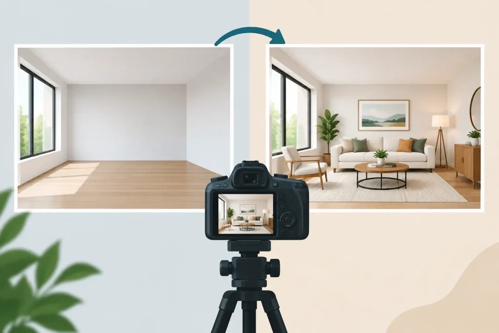
A staging example makes the difference visible before the campaign begins. It shows how small changes can shift a buyer’s attention from distractions to the features that support the price: natural light, usable living zones, storage, ceiling height, views and outdoor flow.
This is particularly relevant in a competitive Mandurah market, where buyers can compare homes quickly across similar price brackets. A property does not need to be extravagant. It needs to present with intent. Clean, well-composed images signal that the home has been properly prepared and the sale is being managed with care.
The benefit is not simply more flattering photographs. Better presentation can attract better-qualified buyers because it communicates liveability without asking them to do the mental work. Buyers are less likely to focus on what they need to fix, move or hide. They can focus on whether the property suits them.
What a staging example before listing photos should reveal
The most useful staging comparison is honest. It does not disguise defects or create expectations that inspections cannot meet. It demonstrates how to remove visual noise and use each space properly.
Room scale and function
A spare room used as a dumping ground can read as wasted space. The same room, cleared and lightly furnished as a study or bedroom, gives it a clear role. That matters because buyers pay for usable space, not square metres they cannot interpret.
The same principle applies to open-plan homes. If dining, living and work areas merge into one busy space, buyers may assume the layout is awkward. Defined furniture placement helps them see where daily life fits. A compact dining setting, appropriately sized sofa and clear walking path can make a room feel more generous without pretending it is larger than it is.
Light, sightlines and focal points
Staging should direct attention towards the strongest features. Open curtains where privacy allows. Remove heavy furniture blocking windows. Position a simple setting to draw the eye towards a garden, balcony or architectural detail.
It also means dealing with the small distractions that dominate a camera frame. Cords, pet bowls, magnets, overflowing shelves, bathroom products and mismatched laundry items all pull focus. They are normal in a lived-in home. They do not belong in the marketing images that are meant to create demand.
The emotional read of the property
Buyers are practical, but they are not purely logical. They want to feel that a home will work for their family, routine or investment plan. A neatly styled entrance feels welcoming. A dining table set simply suggests entertaining. Fresh linen and clear bedside surfaces make a bedroom feel restful rather than cramped.
There is a line, however. Too much styling can look staged in the wrong way. Overly personal props, excessive cushions or furniture that is clearly too small for the room can reduce trust. The goal is believable, polished and proportionate.
Prepare the home before the photographer arrives
Professional staging can be worthwhile, especially for vacant homes, premium properties or rooms with difficult proportions. But not every campaign needs a truckload of hired furniture. The right approach depends on the home, likely buyer and expected sale price.
Start with an objective walk-through. Stand at the doorway of each room and ask one question: what will a buyer notice first? If the answer is clutter, darkness, an unclear room purpose or tired presentation, address that before thinking about decorative touches.
Work through the practical foundations first. Declutter benches, wardrobes and open shelving. Remove excess furniture to improve movement through the home. Clean windows, floors, bathrooms and outdoor areas properly. Replace blown globes and use matching light temperatures where possible. Small maintenance issues, such as loose handles, cracked switch plates or peeling paint, should be fixed rather than photographed around.
Then consider furniture placement. Keep the pieces that show how the space works and remove what makes it feel tight. In a living room, that might mean retaining one sofa, a chair and a coffee table rather than every seat the household owns. In a bedroom, make the bed the feature and clear the floor around it.
Personal items deserve special attention. Family photographs, collections, religious items, paperwork and medication are all better packed away for photography and inspections. This protects privacy while allowing buyers to imagine the property as their own.
Outside, presentation begins at the street. Clear the driveway, move bins out of sight, sweep paths, trim untidy growth and check the front door area. For properties with courtyards, balconies or alfresco zones, show enough furniture to establish the purpose of the area without blocking the usable space.
Finally, plan photography around the light. A good photographer will guide this, but sellers should know which areas receive the best morning or afternoon sun. Homes with strong outdoor spaces, water glimpses or west-facing entertaining areas may benefit from a later shoot. Timing is part of marketing strategy, not an afterthought.
Common listing-photo presentation mistakes to avoid
The common mistake is assuming buyers will look past presentation. Some will. Many will not. Online, there is no agent beside them to explain a room or point out potential. The image has to do that work.
Another mistake is styling for the owner rather than the buyer. A home can be comfortable for the people living in it while still photographing poorly. Large recliners, a packed toy corner or a home office spread across the dining table may be completely practical. For the campaign, they can make rooms appear smaller or less versatile.
Vacant properties carry a different risk. Empty rooms can look cold and difficult to judge in photographs. Virtual furniture may suit some campaigns, particularly where physical staging is not commercially sensible, but any digitally added furniture should be clearly identified and should not alter the apparent size, outlook, fixtures or condition of the home. WA Consumer Protection’s guidance on selling property makes clear that misleading claims in property photographs are prohibited. Buyers should be able to understand what will actually be present at inspection.
Do not spend heavily on styling while ignoring more valuable work. If paint is badly marked, gardens are neglected or a room has an obvious repair issue, fix the fundamentals first. Presentation supports price. It does not replace condition, accurate pricing or a disciplined negotiation process.
When full staging is worth the investment
Full staging is often most effective when a property is vacant, architecturally distinctive, aimed at a higher price point or competing with polished new builds. It can also help when the existing furniture is dated, oversized or does not suit the room layout.
For other homes, partial staging may be the better call. Retain quality key pieces, hire only what is needed for important rooms and focus the budget on photography, repairs and campaign reach. There is no automatic formula. The question is whether the presentation work is likely to strengthen buyer perception enough to justify the cost.
A capable agent should give clear advice here, not push styling because it is fashionable. Beshay Realty approaches presentation as part of the sale strategy: identify what buyers need to see, prepare the property to show it clearly, then market it with purpose.
Before approving listing photos, view them as a buyer would. Can you immediately understand the home? Does every image earn its place? Does the campaign show the features that support the asking price? If the answer is no, make the changes before the property goes live. You get one first impression online. Make it do its job.